
Monochrome icons used at 32x32, 48x48 and above
| Affects | Status | Importance | Assigned to | Milestone | |
|---|---|---|---|---|---|
| ubuntu-mono (Ubuntu) |
Triaged
|
Low
|
Unassigned | ||
Bug Description
Binary package hint: ubuntu-mono
I'm assuming that monochrome icons should only appear on gnome-panel applets (indicator and notification area); anywhere else the standard (from Humanity) version should be used.
## Where ##
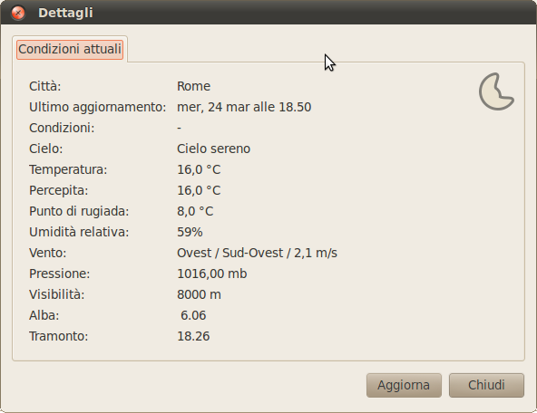
* weather applet: add weather applet on panel, select a location, then choose Details: the dialog shows a monochrome icon for weather status
* clock: as previous, add a location to show weather, then move the pointer over the clock: the icon in tooltip is monochrome
* power: if you have a laptop, click on indicator icon and choose Details, the icons on the left side are monochrome
## Expected ##
All previous cases should use the 48x48 icons available in Humanity icon theme, not the monochrome.
## Why ##
The reason is related to standard fallback lookup algorithm for icon themes. When you search for icon "xxxx" at size 48x48 and current theme only provides 22x22, this one will be used, in order to preserve visual coherence. See http://
## How to fix ##
On GNOME (Art) upstream we are working in order to have support for Symbolic Icons for 2.32/3.0 (http://
ProblemType: Bug
Architecture: i386
Date: Wed Mar 24 22:44:32 2010
DistroRelease: Ubuntu 10.04
InstallationMedia: Ubuntu 10.04 "Lucid Lynx" - Beta i386 (20100318)
Package: ubuntu-mono 0.0.10
PackageArchitec
ProcEnviron:
LANG=it_IT.utf8
SHELL=/bin/bash
ProcVersionSign
SourcePackage: ubuntu-mono
Uname: Linux 2.6.32-17-generic i686

The way I had done in humanity was to have to have the color icons in 32/48px , which solves this problem.
Color icons can be copied from humanity instead of merging. ;-)