
fonts aren't properly hinted in KDE applications
| Affects | Status | Importance | Assigned to | Milestone | |
|---|---|---|---|---|---|
| kdebase (Ubuntu) |
Fix Released
|
Undecided
|
Unassigned | ||
| qt-x11-free (Ubuntu) |
Fix Released
|
Undecided
|
Unassigned | ||
Bug Description
Binary package hint: kdebase
I'm not sure where to put this, I though I'd place it in "kde" and see if anyone can suggest a better spot.
I use Ubuntu Feisty (all repositories up to and including multiverse; I installed Dapper and updated from there), with the Gnome interface, on a Dell Latitude D620 laptop. (I'll fill in with more details if asked.)
The only KDE thing I use is Amarok. My problems all started when I noticed that the fonts in Amarok got rendered uglier than those in the other applications. As far as I can tell, they were (and still are) rendered with anti-aliasing (grayscale, I think) without hinting.
(I had fonts set-up to my taste, using the default Gnome applet, when I installed Ubuntu, with full hinting and sub-pixel AA. It works just right in Gnome apps, and it used to work OK in Amarok.)
I don't know what triggered the change, it was probably an update of some Qt thing. I didn't notice this right away, so I'm not sure.
I tried looking for info on the forums -- because I'm not really familiar with KDE. A few guys tried to help me by suggesting I install kcontrol and use it to change KDE's font settings. (That's what I wanted to do, I just didn't know the name of the package.) I tried that, and I had some issues with kcontrol -- see bug #80444 -- but I got around those.
OK, so now I tried looking through kcontrol's font settings. For once, sub-pixel anti-aliasing and hinting were already turned on, but it doesn't seem to work at all. I tried all sorts of disable-
I'll attach a few screen-shots right away. Take a look at bug #80444, there's a screenshot there of how it used to look.

| Changed in kdebase: | |
| status: | Unconfirmed → Fix Released |
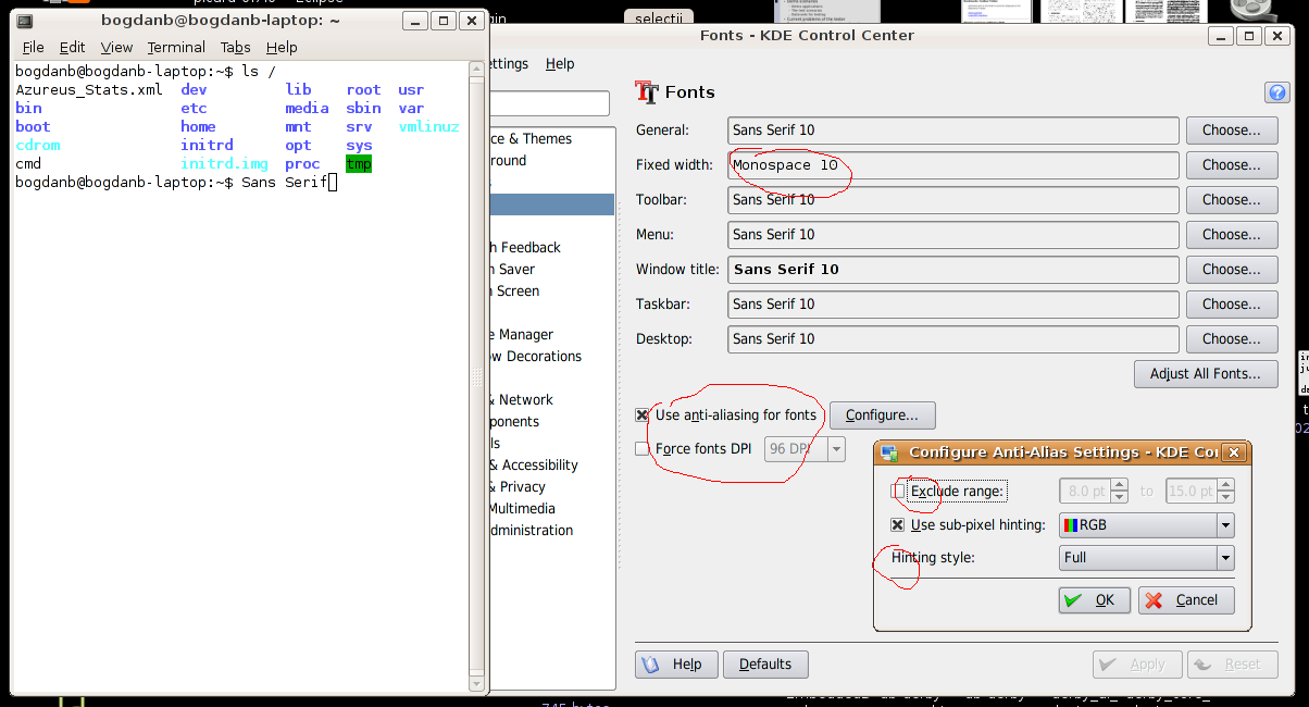
OK, so here's a screenshot. To the left is a Gnome terminal, notice how fonts are well-rendered. Also, the window decorations are drawn by GTK, notice they're well-hinted on all windows.
Compare with the fonts inside the KDE Control Center window. Try a 400x zoom on the image (don't use a smooth zoom, use something that can show you the pixels). See how the F's or the H's look dirty or blury (the vertical and horizontal lines are not aligned with the pixers).
Also, notice how the Monospace font is well-rendered. I don't know why that happens. I tried it at different sizes and it's always correctly-hinted.
As far as I know, I use the exact same fonts in gnome (though it's called just "Sans" in Gnome's font dialog, not "Sans serif").
Let me know what other info I can give.