

© 2004
Canonical Ltd.
•
Terms of use
•
Data privacy
•
Contact Launchpad Support
•
Blog
•
Careers
•
System status
•
0e1f616
(Get the code!)
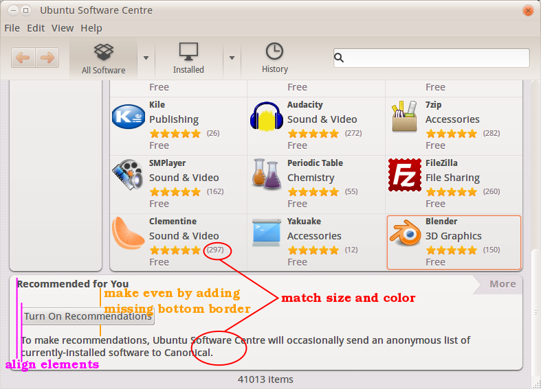
Yes, that is much better, thanks Kiwinote. I see three things still to fix:
* the heading should have a bottom border, like it does in the tiled sections
* the button and caption should align horizontally with the heading
* the caption should be small and grey, like the category counts or the "X of Y people found this review helpful".