
the Human "cancel" icon is not appropriate
Bug #45444 reported by
Andrea Garbarini
| Affects | Status | Importance | Assigned to | Milestone | |
|---|---|---|---|---|---|
| tangerine-icon-theme (Ubuntu) |
Fix Released
|
Low
|
Unassigned | ||
Bug Description
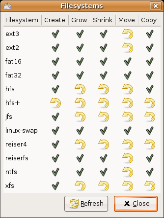
I believe that gnome's default "cancel" icon (a red cross) is more meaningul, the "cancel" icon provided by the human iconset would be more appropriate for the "revert" action (for which a very similar icon is already provided). Just take a look at the non-sense this "cancel" icon might lead to :)
(screenshot attached)
regards, andre

| Changed in ubuntu-artwork: | |
| status: | Unconfirmed → Confirmed |
To post a comment you must log in.
what should that yellow arrow stand for? a red cross would make way more sense here... mmm perhaps it's just the gparted developers who should have used a different icon here, based on the icon's "meaning" and not on its looks?