Network-Manager WEP icon not really useful

Bug #36017 reported by Lionel Dricot
14
Affects Status Importance Assigned to Milestone
tango-icon-theme
Invalid
Medium
tango-icon-theme (Ubuntu)
Fix Released
Medium
Daniel Holbach

Bug Description

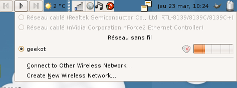
With the new Dapper icons, the WEP icon looks like nothing known before. I guess it's the "lock" WEP icon but it doesn't mean anything to me. I think this icon must be set back as a lock or something similar that speaks by itself.

Revision history for this message
Mark Shuttleworth (sabdfl) wrote : Re: [Bug 36017] Network-Manager WEP icon not really useful

Could you attach a portion of a screenshot, highlighting the icon
concerned? Alternatively, take a look at
http://daniel.holba.ch/ubuntu/ic/ and tell me what icon it is that is
giving you grief, and I'll see if we can get that addressed.

Revision history for this message
Lionel Dricot (ploum-deactivatedaccount) wrote : Network-Manager applet screenshot

I think that the icon is the following :

http://daniel.holba.ch/ubuntu/ic/#network-wireless-encrypted
(great page ! good work !)

But as you can see on the screenshot, it's not obvious at all that this is an encrypted network. (at least if wasn't for me)

I take as a comparison the Nokia 770 network manager :
- A network without icon is open
- A network with a lock is wep protected

And sometimes I see a network with a big lock with 3 key holes in it. It took me 3 seconds to guess that it must be a WPA protected network (altough I have no confirmation for now ;-) )

Anyway, it's of course not a critical issue.

Revision history for this message
Mark Shuttleworth (sabdfl) wrote : Re: [Bug 36017] Network-Manager WEP icon not really useful

Interesting, that is not in any of the nm themes that I can see at our
Icon priority page. Can you find the offending icon on:

http://daniel.holba.ch/ubuntu/ic/

Daniel, I wonder if we haven't missed some NM icons?

 subscribe <email address hidden>

Revision history for this message
Lionel Dricot (ploum-deactivatedaccount) wrote :

Upstream Tango bug reported here :
https://bugs.freedesktop.org/show_bug.cgi?id=6363

Revision history for this message
Daniel Holbach (dholbach) wrote :

Mark, I suppose you will have to add

 * nm-stage01-connecting10
 * nm-stage02-connecting10
 * nm-stage03-connecting10
 * nm-vpn-connecting10
 * network-wired
 * network-wireless
 * network-wireless-encrypted

to your iconprio branch as well. Sorry, I must have overlooked them

Revision history for this message
Mark Shuttleworth (sabdfl) wrote :

No problem I've already pushed those out so the sheet should be updated.

 status confirmed

Changed in ubuntu-artwork:
status: Unconfirmed → Confirmed
Revision history for this message
In , Lionel Dricot (ploum-deactivatedaccount) wrote :

With the Tango icons, the WEP icon in Network-Manager looks like nothing known
before. I guess it's the "lock" WEP icon but it doesn't mean anything to me. I
think this icon must be set back as a lock or something similar that speaks by
itself.

I take as a comparison the Nokia 770 network manager :
- A network without icon is open
- A network with a lock is wep protected

And sometimes I see a network with a big lock with 3 key holes in it. It took me
3 seconds to guess that it must be a WPA protected network (altough I have no
confirmation for now ;-) )

Revision history for this message
In , Lionel Dricot (ploum-deactivatedaccount) wrote :

Created an attachment (id=5031)
Screenshot of this case

Look at the screenshot and be honnest : could you really guess that this means
WEP encrypted wireless ?

Revision history for this message
In , Lionel Dricot (ploum-deactivatedaccount) wrote :
Revision history for this message
In , Jakub Steiner (jimmac-redhat) wrote :

Lionel, the Network manager icons are not part of tango base theme. If Ubuntu
ships these icons, file a bug against the network manager product there.

Revision history for this message
Lionel Dricot (ploum-deactivatedaccount) wrote :

According to Jimmac, this is not a Tango icon.
https://bugs.freedesktop.org/show_bug.cgi?id=6363

Changed in tango-icon-theme:
status: Unconfirmed → Rejected
Revision history for this message
Daniel Holbach (dholbach) wrote :

Sorry for the noise, reopened upstream.

Changed in tango-icon-theme:
status: Rejected → Unconfirmed
Revision history for this message
In , Lionel Dricot (ploum-deactivatedaccount) wrote :

I tought it was a Tango one. Sorry for the noise.

Revision history for this message
In , Daniel Holbach (dholbach) wrote :

It's this one:

daniel@bert:~/tango-icon-theme-0.7.1$ find . | grep encrypted
./scalable/status/network-wireless-encrypted.svg
./22x22/status/network-wireless-encrypted.png
./16x16/status/network-wireless-encrypted.png
daniel@bert:~/tango-icon-theme-0.7.1$

or
http://webcvs.freedesktop.org/*checkout*/tango/tango-icon-theme/scalable/status/network-wireless-encrypted.svg?rev=1.2

Revision history for this message
In , Jakub Steiner (jimmac-redhat) wrote :

D'OH, this was indeed added in.

The thing with the metaphor is the following -

You're suggesting that the padlock is a well known metaphor and we shouldn't aim
to use something else that isn't well known. In tango howerevr, we tried to
avoid the floppy for save and we tried to avoid the lock for "secure"
communication.

It may be that the icon at 16x16 does not resemble a shield that well. I will
look into fixing that. But I don't like ditching the new metaphor because "it
wasn't done before". Personally I belive the shield works much better than a
padlock for this kind of stuff. I will suggest running a small test in our
usability lab to see if people have a problem identifying encrypted networks.

Revision history for this message
In , Lionel Dricot (ploum-deactivatedaccount) wrote :

It could work. It's just that, honnestly, I didn't see at all that it was a
shield... Sorry for that (oooops)

Revision history for this message
In , Jakub Steiner (jimmac-redhat) wrote :

Created an attachment (id=5043)
16x16 version of the wi-fi shield

Would this be more recognisable at 16x16?

Revision history for this message
In , Lionel Dricot (ploum-deactivatedaccount) wrote :

Jakub, thanks a lot. This icon is indeed more recognisable than the previous one.

As a side not, I will add that I disagree with you about the metaphor. Changing
the Floppy disk metaphor was a good one because most of new users have never
seen a floppy disk. (I was astonished to see that but it's real !) Asking them
to click on a floppy-disk is a non-sens and Tango project successfully changed
that ! That a great step.

Unlike the floppy, most people have already seen a lock. I think that if you
show a lock to an user, he would think : I cannot access this unless I have the
key ! That seems a perfectly good behaviour to describe a secure wireless network.

In my mind, the shield is more a metaphor of "protecting myself". For example,
the famous McAfee Antivirus.

But it is of course only my opinion and I'm not an artist at all. You have more
experience and a whole usability lab, don't take my word too seriously ;-)

Revision history for this message
In , Lionel Dricot (ploum-deactivatedaccount) wrote :

Hmm... I just showed this icon to a friend. The old one in network-manager (to
gave hime context) and the new one, telling him it will replace it.

He asked me : "Why did they put a red eye in the networks list ?"

Revision history for this message
In , dobey (dobey) wrote :

Yes. A shield is about protection, ie, secure communication. A lock is about
access, ie, password request. These are very distinct operations. We should not
use the same icon for both. When you see a lock in an authentication request
dialog, do you automatically assume that the connection your password is being
sent over is secure, or that your password itself is securely encrypted? If you
do, then you just pointed out why exactly these need to be distinct metaphors.
Nobody said the icon in Tango was perfect. It is, however, much better than the
lock. The red radio waves to show that it is wireless, may not be the best way
to show it. Perhaps we can place an antenna icon on the shield instead. And
perhaps we could make the shield gold, rather than grey. I won't disagree that
it could perhaps use a few minor changes. However, I will strongly disagree that
it should be a lock.

Revision history for this message
Daniel Holbach (dholbach) wrote :

That's not a ubuntu-artwork bug.

Changed in ubuntu-artwork:
assignee: nobody → dholbach
Changed in tango-icon-theme:
status: Confirmed → In Progress
Revision history for this message
Lionel Dricot (ploum-deactivatedaccount) wrote :

Edgy icon looks like a shield. This fixes the issue IMHO

Changed in tango-icon-theme:
status: Confirmed → Fix Released
Revision history for this message
In , Jakub Steiner (jimmac-redhat) wrote :

I've commited the touched up 16x16 shield icon, but closing the as not a bug as we do want to stick with the shield metaphor.

Changed in tango-icon-theme:
status: In Progress → Invalid
Changed in tango-icon-theme:
importance: Unknown → Medium
Changed in tango-icon-theme:
importance: Medium → Unknown
Changed in tango-icon-theme:
importance: Unknown → Medium
To post a comment you must log in.
This report contains Public information  
Everyone can see this information.

Other bug subscribers

Remote bug watches

Bug watches keep track of this bug in other bug trackers.