
New Database druid dialog layout appaling
Bug #61128 reported by
Danny Staple
| Affects | Status | Importance | Assigned to | Milestone | |
|---|---|---|---|---|---|
| gaby (Ubuntu) |
Invalid
|
Undecided
|
Unassigned | ||
Bug Description
Using 2.0.2-6.1ubuntu1 on Dapper.
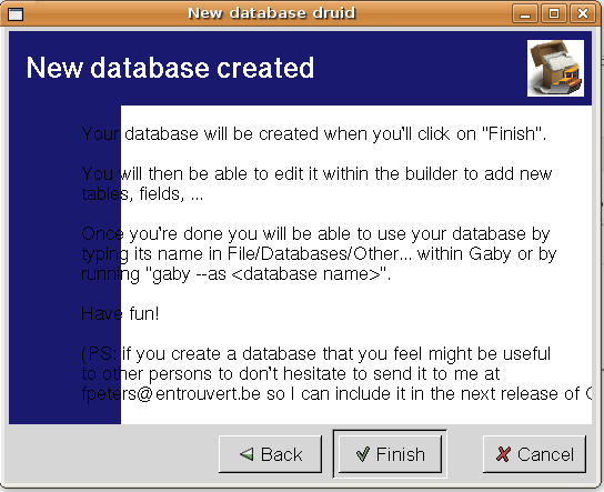
After go through creating a database, one is eventually presented with a dialog with the heading: "New Database created".
The layout looks like there should be a blue background with a white text box and black text in that. The white box is placed in the lower right hand corner, leaving an L-shaped blue bar, its a fairly standard web/presentation layout. But the dialog is narrow enough that the text is across the blue bar and the white box - which looks awful.
The box can be stretched to make the text readable.
A simple fix would be to make the box larger, or take into account the text size when choosing the dialogs size (considering that system fonts may vary).

| Changed in gaby: | |
| status: | New → Confirmed |
To post a comment you must log in.
Thank you for taking the time to report this bug and helping to make Ubuntu better. You reported this bug a while ago and there hasn't been any activity in it recently. We were wondering is this still an issue for you? Can you try with latest updates or the Ubuntu release? Thanks in advance.