rhythmbox is ugly; fix included

Bug #116952 reported by Nicholas Gee
2
Affects Status Importance Assigned to Milestone
human-icon-theme (Ubuntu)
Invalid
Wishlist
Kenneth Wimer

Bug Description

Binary package hint: human-icon-theme

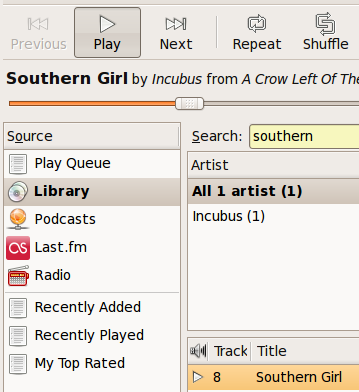
Rhythmbox is an app a lot of people spend a lot of time looking at, but is really unattractive because of some very old icon sets.

Laura Taimila wrote an excellent guide on making it look a bit more Human. I've added a radio icon from another thread to make a consistent improved look for rhythmbox. Instructions and files are in the third post Definitely not perfect but an improvement and a possibility for someone with art skills to take it a bit further?

http://ubuntuforums.org/showthread.php?t=451095

Changed in human-icon-theme:
assignee: nobody → ubuntu-art
importance: Undecided → Wishlist
Revision history for this message
Kenneth Wimer (kwwii) wrote :

Could you post a direct link to the artwork or attach it directly in the bug? I rarely read the forum and simply forget my login everytime I try to view artwork on it. Not sure why you need a login to see the artwork to begin with, really.

Revision history for this message
Nicholas Gee (nicholas-gee) wrote :

I've attached a screenshot of the new icons, there is also a new tray icon which is slightly better looking musical note; but isn't in the screenshot.
The source files are in the thread or I can post them here as well if you want.

Not sure what's happening with rhythmbox, the new version released seems to have a tango icon theme that some people have touched up in this thead; but I prefer Lauri's icons...they seem more Human.

http://ubuntuforums.org/showthread.php?t=430476

Revision history for this message
Nicholas Gee (nicholas-gee) wrote :

Here are the files themselves, I should stress these mostly come from Lauri Tamila and his guide (http://www.taimila.com/orange-look.php) with the radio icon coming from a thread mentioned above.

Revision history for this message
tdatu (macroz10) wrote :

hello there...
I'm a newbie member of the group, pretty much following the dicussion board, but I'm getting a little lost on what is the goal of the project. I would like to help in terms of my art skill. I would like to receive a simple task at first...thanks.
tdatu

Revision history for this message
Andreas Nilsson (andreasn) wrote :

We recently modified the icons in rhythmbox upstream. [1]
You can check them out and see if you think they blend well together with human. If think they do a pretty good job.

Anyway, in the process we fixed the names and made it all more themeable as well.
Here are the new names:

actions:
internet-radio-new.png
playlist-automatic-new.png
playlist-new.png
podcast-new.png

apps:
rhythmbox.png

places:
library-internet-radio.png
library-podcast.png
playlist-automatic.png
playlist.png

I'll put the names up in the gnome wiki as well later today. [2]
Now we just need some High Contrast icons, but that's another issue (and it's desperately, desperately needed).

1. http://bugzilla.gnome.org/show_bug.cgi?id=380896
2. http://live.gnome.org/ThemableAppSpecificIcons

Revision history for this message
tdatu (macroz10) wrote :

NIcolas Gee did awesome on the icons.
anyway, here's what I just thought internet-radio icon should look like.
thanks.

Revision history for this message
Prajjwol (prajjwol) wrote : Re: [Bug 116952] Re: rhythmbox is ugly; fix included

Hey, i am new here in launch pad and i am not getting any idea what i am
going do here so can anyone guide me what i gotta do?

On 6/1/07, tdatu <email address hidden> wrote:
>
> NIcolas Gee did awesome on the icons.
> anyway, here's what I just thought internet-radio icon should look like.
> thanks.
>
>
> ** Attachment added: "internet-radio icon"
> http://launchpadlibrarian.net/7907349/radio.png
>
> --
> rhythmbox is ugly; fix included
> https://bugs.launchpad.net/bugs/116952
> You received this bug notification because you are a member of Ubuntu
> Artwork Team, which is a bug assignee.
>

Revision history for this message
Brett Alton (brett-alton-deactivatedaccount) wrote :

@tdatu:

I think that icon is too gimmicky. The human, tango and tangerine icons are a bit more subtle and smooth. They also have a bit more depth to them with subtle gradients.

If the icon were to have radio waves radiating from the music-note, similar, but not exactly the same as the RSS feed logo, we might have an icon.

Revision history for this message
Troy James Sobotka (troy-sobotka) wrote :

tdatu, Prajjwol -- there isn't anything to 'do' really.

Nice icon. Ignore the bikesheds.

Revision history for this message
tdatu (macroz10) wrote :

oh ok...cool. I'll try your suggestion--"more depth, subtle gradients, not RSS logo, and not gimmicky."
thanks for the feedback, appreciate it.

----- Original Message ----
From: brettalton <email address hidden>
To: <email address hidden>
Sent: Saturday, June 2, 2007 5:05:24 AM
Subject: [Bug 116952] Re: rhythmbox is ugly; fix included

@tdatu:

I think that icon is too gimmicky. The human, tango and tangerine icons
are a bit more subtle and smooth. They also have a bit more depth to
them with subtle gradients.

If the icon were to have radio waves radiating from the music-note,
similar, but not exactly the same as the RSS feed logo, we might have an
icon.

--
rhythmbox is ugly; fix included
https://bugs.launchpad.net/bugs/116952
You received this bug notification because you are a member of Ubuntu
Artwork Team, which is a bug assignee.

Revision history for this message
Adam Niedling (krychek) wrote :

Is rhythmbox still ugly? Can this report be closed?

Changed in human-icon-theme:
status: New → Incomplete
Revision history for this message
Kenneth Wimer (kwwii) wrote :

We did not include these icons so the report should stay open

Changed in human-icon-theme:
assignee: ubuntu-art → kwwii
Revision history for this message
Adam Niedling (krychek) wrote :

Don't you think this would get more attention of it was posted on brainstorm.ubuntu.com ? There is not much going on here.

Revision history for this message
Kenneth Wimer (kwwii) wrote :

To be honest it is simply a matter of including the proposed icons in the package

Adam Niedling (krychek)
Changed in human-icon-theme:
status: Incomplete → New
Revision history for this message
Nicholas Gee (nicholas-gee) wrote :

This bug does seem to have been made redundant by the improved tango icons that were included I think in the gutsy release. While rhythmbox IMHO still needs a bit of work these icons won't do much to address that. I would be happy for this to be closed or deleted.

Revision history for this message
Adam Niedling (krychek) wrote :

So I'm closing this for the original reporter's request.

Changed in human-icon-theme:
status: New → Invalid
To post a comment you must log in.
This report contains Public information  
Everyone can see this information.

Other bug subscribers

Remote bug watches

Bug watches keep track of this bug in other bug trackers.