"Upgrade" page is unclear
| Affects | Status | Importance | Assigned to | Milestone | |
|---|---|---|---|---|---|
| ubuntu-website-content |
Fix Released
|
Undecided
|
Anthony Dillon | ||
Bug Description
I just ran an informal usability test by watching a colleague who wanted to upgrade from Ubuntu 11.04 to 11.10. (Disclaimer: This was only *one* person, but I think the fault identified here is obvious.)
First she did a Google search for "ubuntu" and went to <http://
However ... She took one look at the "Upgrade" page <http://
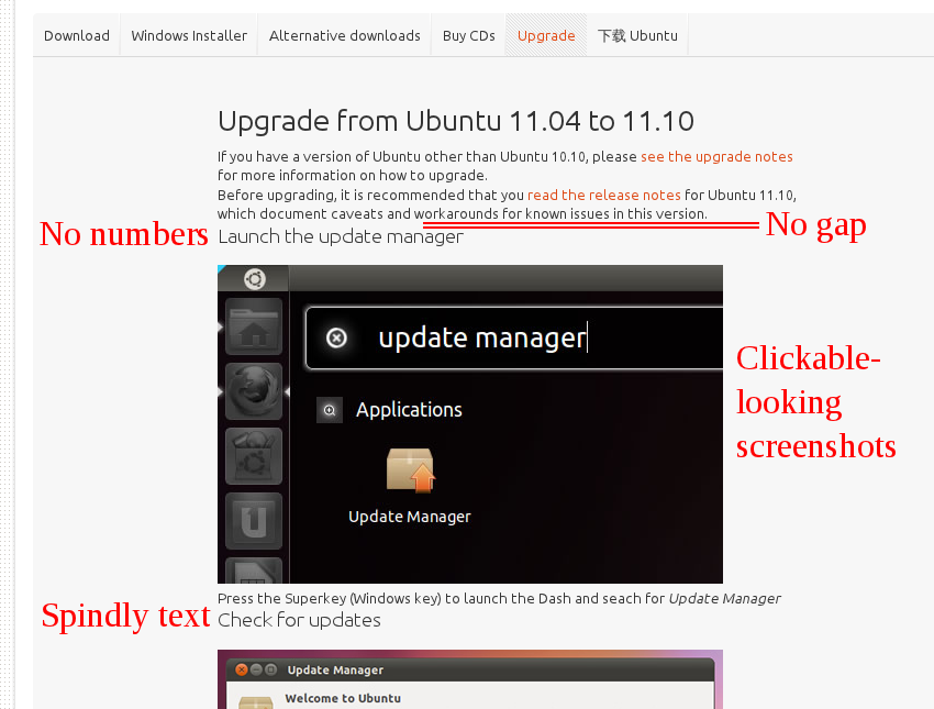
So, there seem to be three problems with the Upgrade page. First, it contains far too much text. For example, it says: "Before upgrading, it is recommended that you _read the release notes_ for Ubuntu 11.10, which document caveats and workarounds for known issues in this version." This could be more than halved in length: "The _release notes_ contain technical information and known issues."
Second, the steps do not look like steps:
- They are lighter weight than the surrounding text. If anything, they should be heavier.
- There is hardly any spacing between them and the text above, which makes them look like part of the same paragraph.
- They are not numbered.
Third, the screenshots do not look enough like screenshots. For example, they could have a torn-off bottom, showing that they are a picture of only part of a screen, rather than a complete window on top of your browser window.

| Changed in ubuntu-website-content: | |
| assignee: | nobody → Anthony Dillon (ya-bo-ng) |
| status: | New → Confirmed |
I have implemented your suggestions. I framed the images to make them appear more like an image. This will go live with the next release of the site. Thank you for bringing this to our attention.